Case study
Metiyu
A dark, editorial store that feels native on both platforms.
Metiyu is an online store built from a Figma design: browse, search, view a product, pick a size, add to cart, apply a promo and pay. The goal was an app that feels at home on both iPhone and Android, with every animation running on the UI thread.
- Year
- 2026
- Role
- Design to code, solo
- Platform
- iOS & Android
From browsing to checkout
- 01
Browse and search
- 02
Product, sizes and gallery
- 03
Buy sheet with stock
- 04
Cart, promo and totals
- 05
Pay
The screens
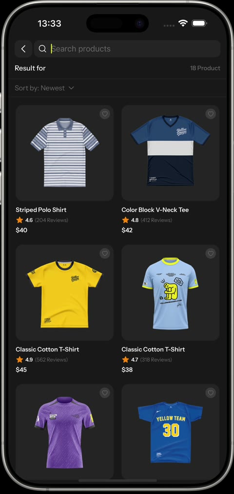
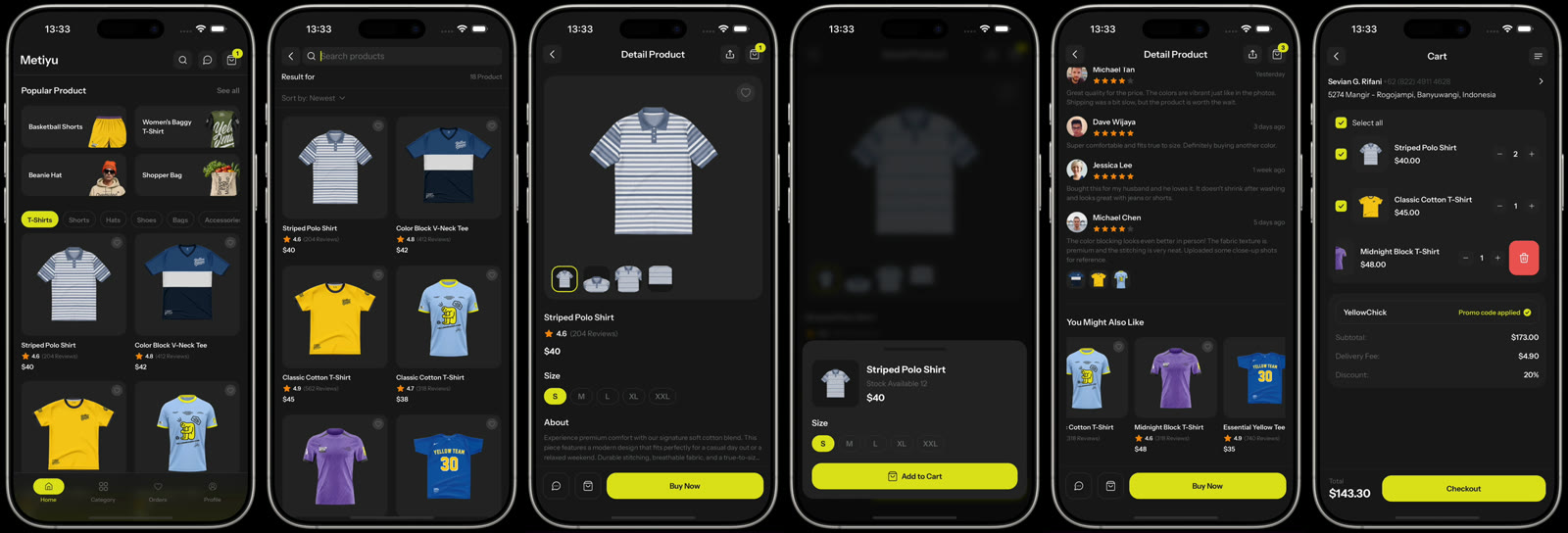
01Search filters live, with a result count and a sort sheet. 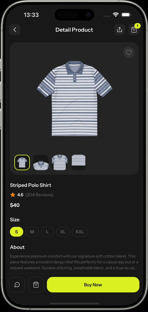
02Product gallery with angle thumbnails and sizes. 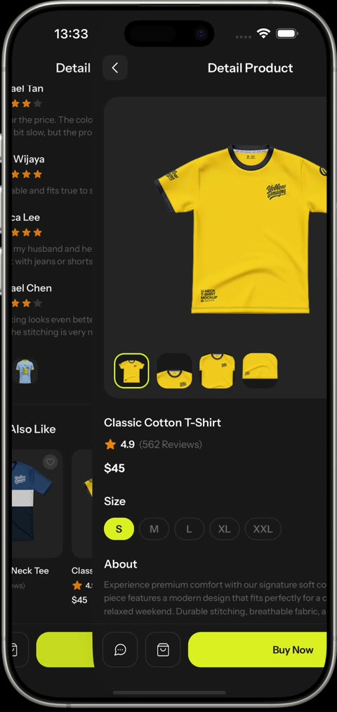
03Swapping products keeps the layout steady. 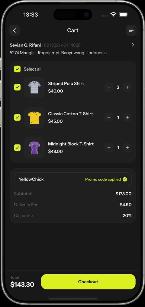
04The cart: per-item select, quantity steppers and promo totals.
Details worth a look
- 01
Navigation that respects each platform
Native slides on iOS, a cross-fade on Android where slide transitions can flash a blank frame. The navigators share the app background, so a back gesture never flashes white.
- 02
Motion on the UI thread
Everything runs on Reanimated shared values. A shared PressableScale gives every card and button the same tactile press, and search results rise into place once as they scroll into view.
- 03
Sheets that stay in sync
The buy, payment and review sheets drive their backdrop and panel from one progress value, so the two never drift apart while opening or closing.
- 04
A cart that adds up
Items are keyed by product and size, so the same shirt in M and L are separate lines. The promo and delivery fee apply only to selected items.
- 05
Blur where the platform allows it
The tab bar is a blurred overlay on iOS and falls back to a brand-tinted gradient on Android, where a live blur behind an overlay is not practical.
Built with
- Expo SDK 56
- React Native
- Reanimated 4
- NativeWind 4
- Expo Router
- expo-image
- React Compiler
Next case study
Math for Kids →